Razer Black Widow

I am writing a long (English) review on this keyboard. I won't have time to translate it to Korean, but here are the pictures used in the review!

At first I did not think I would like this keyboard, but its actually pretty decent.
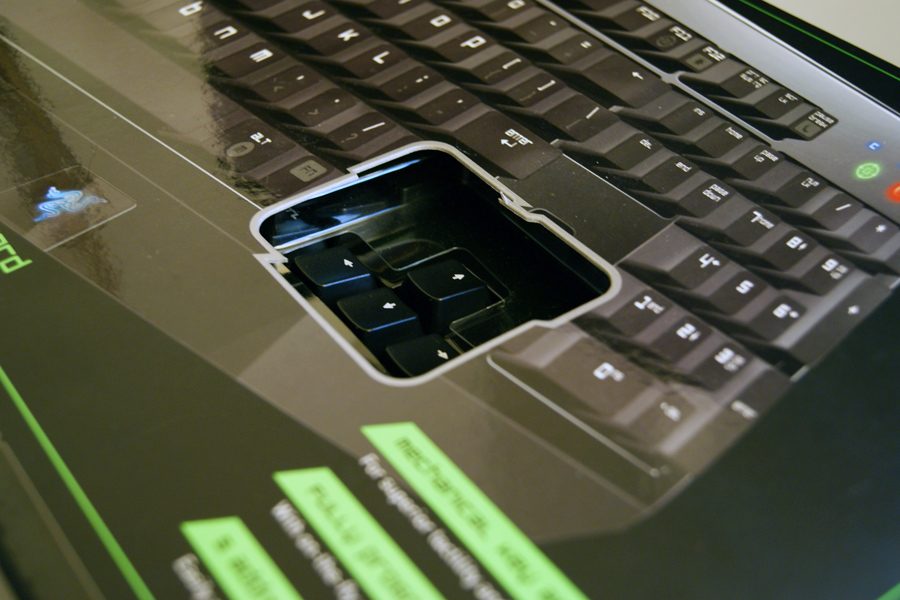

box_tryme.jpg

The box lets you "try out" the keyboard.
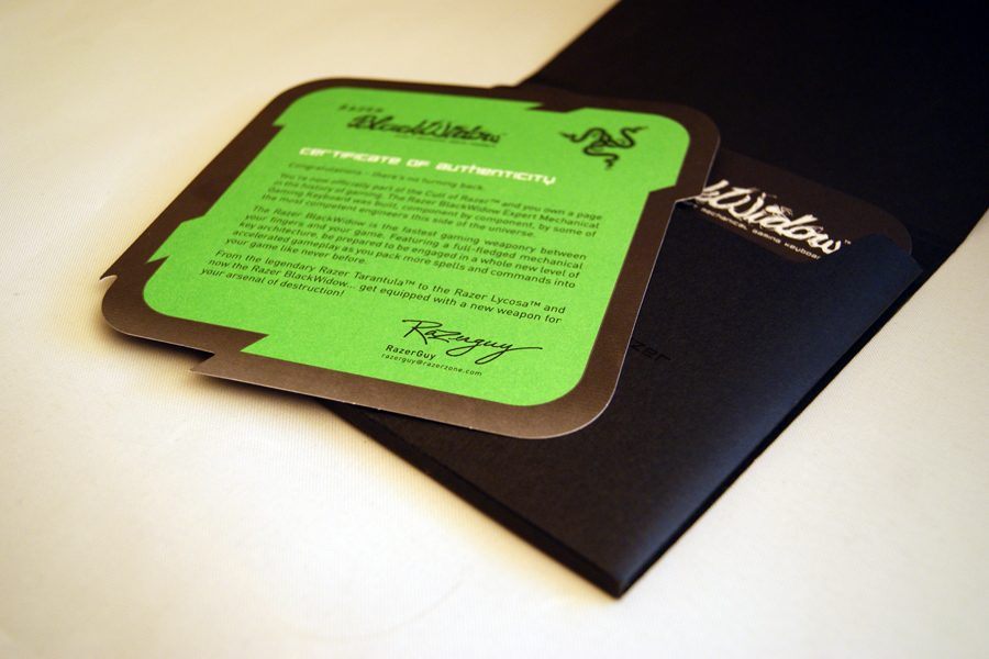

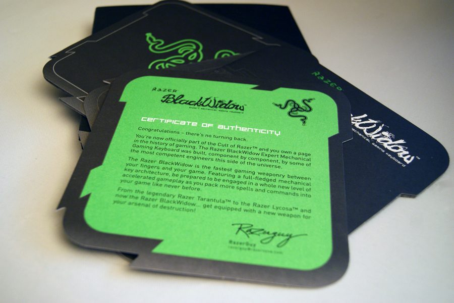
box_manuals.jpg

manuals.jpg

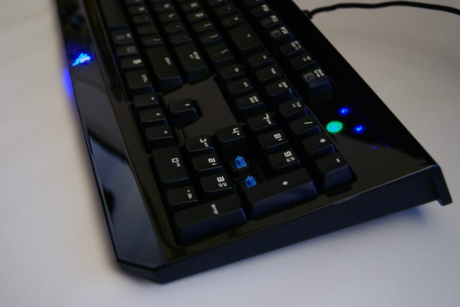
ohhhshiny.jpg

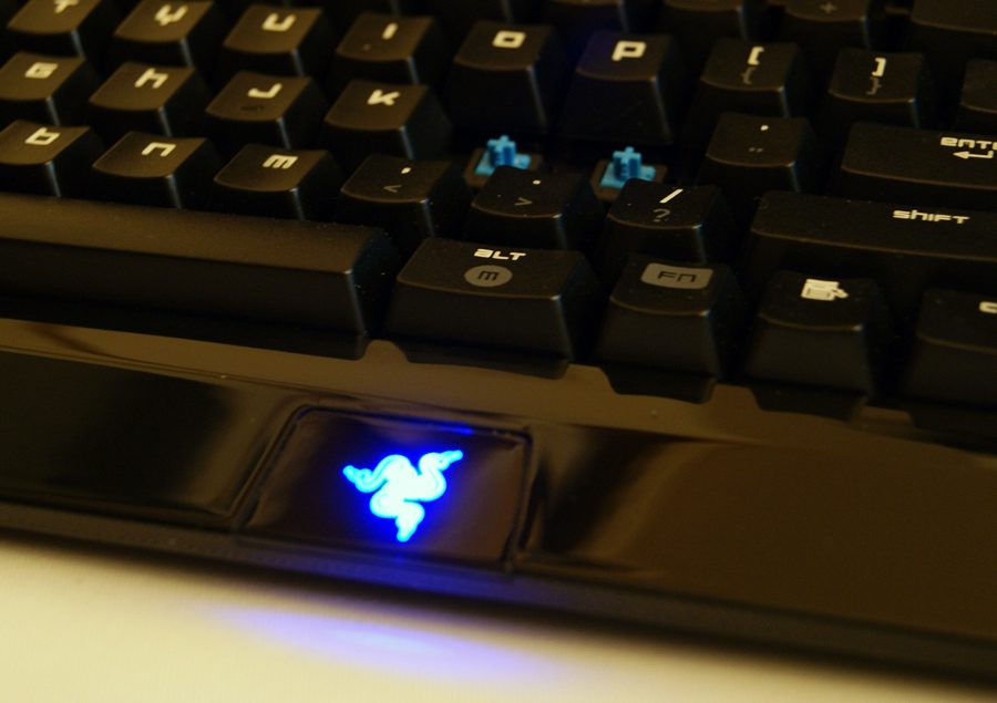
Cherry MX Blue


ohhhshiny2.jpg

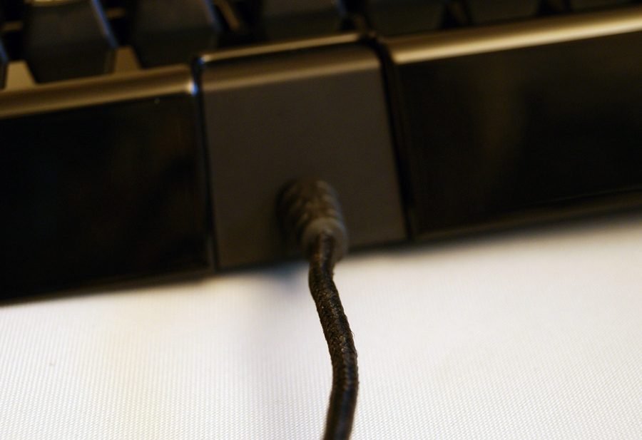
cable.jpg

Braided (fabric) cable


razerlogo.jpg

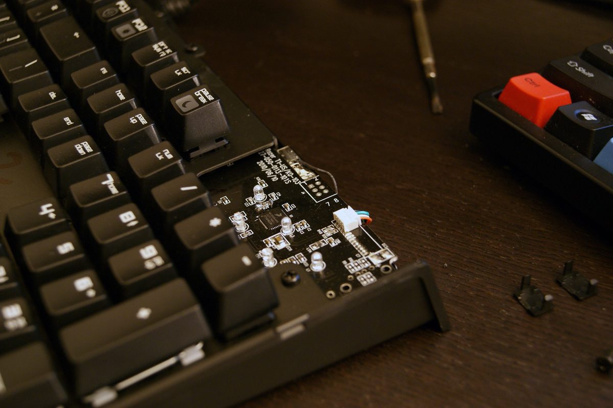
pcb.jpg

Black PCB. Korean and English version is the same... there are 2 extra solder points for Korean switch keys next to each alt key. Keyboard and PCB is made in OEM by iONE in China.
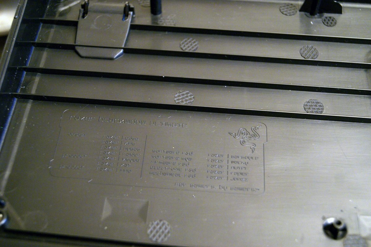

DSC03480.jpg

"Hidden" staff list - nice easter egg

이전 댓글 25
적운 2010-11-05 20:23
오호 어여 국내 수입 대기를 ...
KEANE 2010-11-05 20:30
오 쌔끈하다는 생각이 절로듭니다
Smile :D 2010-11-05 20:58
키캡폰트 완전 귀여운데요 :D
Vocalism 2010-11-05 21:05
RAZER 다운 디자인이네요 ㅎㅎ
taijimania 2010-11-05 21:17
$79.99에 나왔는데 국내 가격이 궁금하네요.. 국내 출시는 11월~12월 사이로 알고있습니다.
이루 2010-11-05 21:43
와..... 키캡폰트때문에 엄청나게 뽐뿌오는군요 -ㅁ-
익휴EQ/최이규 2010-11-05 21:52
우와... 이거 참 멋있네요?  80달러면 얼마에 나오려나...
김심바 2010-11-05 22:15
언제나 디자인 하나만큼은 최고입니다.
duck0113 2010-11-05 22:56
키캡좀 뒤집어서 보여주세요.. 를 누가 영어로좀.........  
이시태 2010-11-05 23:53
Fine, almost users can read english.
해피벅스™ 2010-11-06 00:03
키캡 폰트가 소문자네요~
kant 2010-11-06 01:16
외관 느낌은 예상대로 DAS III와 비슷하네요. 확실히 외국은 Glossy 케이스 선호도가 높은 것 같네요. Razer라면 두말할 것도 없고. ^^;
sshtel 2010-11-06 02:04
would you show me bottom of the key caps?how thick is it?
webwit 2010-11-06 07:06
I'll be awaiting your review :)I can't review the boards, but I can review the looks!It reminds me of Das Keyboard, both are totally not my style. The shapes of the cases have blobs sticking out and weird curves. The gloss makes it look cheap to me, just like plastic painted to look like a metal, glossy plastic is ugly compared to glossy natural material. They want to look expensive. They fail. Too much branding in my face, such as that Razor led. The font used on the key caps sort of sums it up to me. Reminds me of old sci fi movies and 8 bit computer games where they wanted a modern font or "sci fi" font. So why are these fonts square and blocky? Well, these fonts were fashionable in a time when the Year 2000 was still a magical event where we would be moving around in our flying cars. And we would all be using computers, everything would be driven by computers! Can you believe it? And as we all know, computers produce square & blocky fonts. Well, in those times anyway. Of course a real futuristic font could render itself without any limitations of shape and such, and this was decades ago. Yet the Das Keyboard and this Razer  keyboard carry such a retro font in an attempt to look fashionable and cool.Summarized: Electro Kitsch of the highest order. Of course, whether you like the looks is highly subjective, this is just my personal opinion.Everything what Razer/Das Keyboard is not, the anti-Razer! Now this is what I like. Art:
Amore 2010-11-06 10:05
레이저 청축 기대됩니다.   키킵인쇄된것이 소문자군요. -_-ㅋ
로페즈 2010-11-06 14:36
개인적으로 들어본 타건 소리도 군더더기없이 야무지던데 어서 국내도 좀 시판 되었으면 좋겟네요. 도대체 언제 나오냐고 전화도 몇번을 했는지..... 
샤우트민 2010-11-06 20:24
전형적인 레이저다운 디자인인거 같네요   근데 저 사이버틱한 글씨체는........적응 안될꺼같습니다.ㅎㅎㅎ
KINO 2010-11-06 22:12
키캡폰트 내스타일이당...
수고 2010-11-06 23:58
사진 보자 마자 폰트 독특하다 했는데 다른분들도 다들 한마디씩 하셨네요 ㅋ
꽁승 2010-11-07 00:33
역시 레이저... 디자인하나는 끝나네요 ㅎㅎ
Lopel 2010-11-09 01:48
좋은 정보 감사드립니다 ^^
육체 2010-11-10 11:49
디자인이 세련돼 보이네요
내랑장난하나 2010-11-15 15:00
개인적으로 청축을 아주 사랑하는데   이 키보드 나오면 무작정 사버릴꺼만 같네요   아~ 너무 간지 나요 ㅋ
레모나 2010-11-24 22:36
먼지와 지문 문제만 아니면 좋은 제품이군요
kdmcode 2011-02-03 21:24
독특하네요.
← 포토 목록으로